Many nonprofit organizations operate with tight budgets, limited staff, and high demand for services, with recent federal funding cuts only exacerbating these challenges. These factors can make it difficult for nonprofits to focus on activities like marketing, website maintenance, and donor experiences.
However, these efforts directly affect your organization’s bottom line and impact. By understanding the benefits of user experience design for nonprofits, your team can improve donor engagement. In this guide, we’ll explore top strategies suited to organizations with varying budgets and time constraints.
Nonprofit UX Design FAQ
What Is UX for Nonprofits?
User experience design (UX) is the process of researching and designing simple and intuitive digital tools, products, or experiences. UX designers work to understand business and audience needs to build capable, useful solutions. Successful UX design uses a human-centered design approach in which the user is considered at every stage of a project, from requirements to testing.
In the mission-driven sector, UX experts and a team comprising content strategists and writers, UI designers, and web developers plan and build websites, staff intranet portals, member portals, and digital experiences (e.g., an interactive impact dashboard).
Why Is UX Design Important?
UX design dictates how supporters engage with your online offerings. After all, even small changes like updating the text in your website’s navigation bar or FAQ page can significantly impact user experience.
Here are some of the core benefits of UX for nonprofits:
- Saves time and money. Investing in UX design at the start of a project helps nonprofits avoid allocating time and money toward costly redesigns and reworking inefficient processes.
- Ensures solutions are valuable to end users. UX design starts with a detailed analysis of the end user’s needs. Designers might interview or survey users and conduct usability testing to inform their plans. This results in user-centered designs aligning with the audience’s needs and behaviors.
- Enhances user experiences. Well-designed websites and digital experiences are intuitive and enjoyable to use, making it easy for supporters to access a nonprofit’s resources, navigate websites, and take action by donating or signing up to volunteer. This builds trust and credibility for the nonprofit, boosts user satisfaction, and increases the chance they’ll return to the website.
- Boosts engagement. Because interacting with the organization digitally feels easy, supporters are likelier to spend additional time on the website and engage with its content. For instance, an intuitive navigation menu and streamlined donation process can lead to higher conversion rates. Supporters will also be more likely to explore more content and seek other ways to get involved when the digital experiences provide clear value and meet their needs without extra time or effort.
What Are the Key Components of Effective Nonprofit UX Design?
While UX elements vary depending on the project, scope, budget, and audience, these elements are seen across most effective UX designs:
- User-centered research and design: Prioritize the needs and behaviors of the intended audience, whether they’re donors, beneficiaries, or volunteers. The best way to do this is by involving them in the process.
- Intuitive navigation: Organize content logically with straightforward, user-friendly menus and labels. Intuitive navigation starts with researching and studying how the site is being used. This typically involves analyzing data from Google Analytics (GA), using heatmaps to track user behaviors, or surveying users. Ensure your central navigation menu and site footer include the most popular, useful resources.
- Mobile optimization: In Q4 of 2024, 62.54% of website traffic was from mobile devices. Accommodate these users by ensuring your digital platforms function well on all devices. For example, content should adjust to fit various screen sizes, image sizes and file types should be optimized for mobile, and clickable elements should be large enough to be easily tapped and activated.
- Digital accessibility: Your digital platforms and content should be inclusive and accessible to all. Follow accessibility guidelines and best practices to accommodate users with disabilities.
- Effective calls to action (CTAs): Incorporate strategic, persuasive CTAs across your website or platform to encourage supporters to take desired actions, such as donating to your fundraisers. For instance, add buttons to the site header that say “Donate Now” and “Volunteer Now” and link directly to the relevant page or form.
- Trust-building elements: Leverage social proof by adding testimonials, success stories, impact metrics, and financial statements to the design. Effective design can also foster trust with supporters by establishing your organization as professional and capable.
- Consistent visuals and branding: UX and branding go hand-in-hand. Infuse consistent brand colors, visuals, and language into your design to create a uniform, recognizable brand identity.
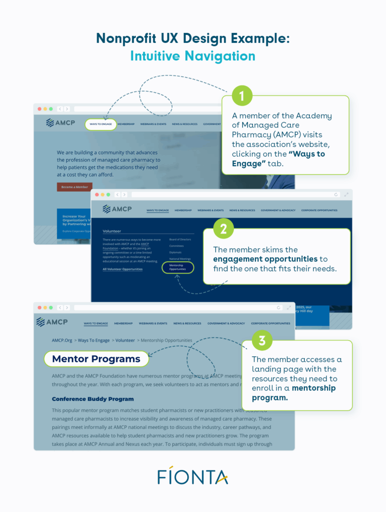
You may have heard the phrase, good design is invisible. In other words, strong UX design meets users’ needs so well that they don’t even notice it. To help visualize how this works, let’s look at an example.
A member of the Academy of Managed Care Pharmacy (AMCP) is looking for ways to increase member engagement by sharing their knowledge with new members or younger professionals. They navigate to AMCP’s homepage and spot the “Ways to Engage” tab prominently in the site’s navigation menu. They hover over the tab and find a link to a landing page about the AMCP’s mentorship program within seconds.
5 Useful UX Tips & Strategies for Nonprofits
1. Work With a Team of Experts
Outsourcing your UX needs to a team of experts ensures you receive professional designs. However, working with an agency that doesn’t understand the nonprofit world can create an unnecessary learning curve that feels like a massive time sink.
At Fíonta, we have over 20 years of experience working with mission-driven organizations to deliver engaging digital services and tailored Salesforce solutions. We understand the sector and nonprofits’ unique needs and pain points, making our client engagements efficient while yielding transformative results.
Our dedicated UX design team aims to create human-centered design rooted in comprehensive user research, a robust content strategy, and logical information architecture. Our philosophy is to prioritize user experiences by integrating UX design into each project from start to finish. We heavily emphasize understanding the audience, who they are, and what they’re looking for, enabling us to create designs that meet those needs. We also evaluate current-state solutions with a critical eye, making recommendations that will support organizational goals and reduce technical debt.
To learn more about Fíonta, our UX services, or our other digital services, contact us today.
2. Conduct Usability Testing
To maximize the return on your investment in UX for nonprofits, you’ll need to work with your UX specialist to conduct detailed research and testing before building anything. While this may sound technical and time-consuming, it’s a relatively low-lift way to ensure your digital platforms are optimized for human users.
Usability testing is the process of observing users as they try to engage with a website, product, or other digital experience. The goal is to learn how people use the solution and identify snags or points of confusion. Here are the basic steps involved in conducting usability tests:
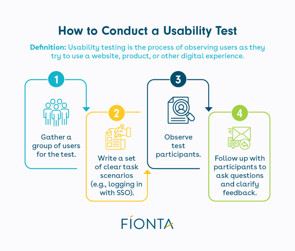
- Gather a group of users for the test. These tests can be conducted in person or remotely.
- Write a set of task scenarios, such as logging into a portal with a single sign-on (SSO) or finding a certain resource. Provide clear instructions that still allow for some flexibility to see how each user’s organic thought process unfolds.
- Observe test participants, paying close attention to how they complete the tasks. Calculate how long it takes, how many clicks it requires, and any signs of confusion or frustration.
- Follow up with participants to answer lingering questions, clarify feedback, and get additional context on their thought processes.
Use the test’s results to compile a set of suggested optimizations, and prioritize them based on organizational goals and resource availability. For instance, not every organization has the time for a complete redesign, but you may be able to solve a recurring issue by simply tweaking the text in your navigation menu.
3. Start Small If Needed
Even if your nonprofit only has a few hours to improve your UX, small steps can save you time and money while enhancing UX design. Again, the user experience should guide your decisions anytime you craft digital tools or engagements. Planning is crucial here, as any amount of research and designing before building will lead to better outcomes and experiences.
- Construct an information architecture (IA) or a content map that can be used to create a consistent navigation structure based on your organization’s goals and user research findings.
- Create wireframes, which are simplified, visual representations of the website or platform you’re planning to build. Wireframes focus more on defining information hierarchies, navigation structures, and task flows than on aesthetics. It’s much easier to make improvements at this stage than after you’ve developed a fully designed user interface.
- Validate (or test) the designs by having users try them, and encourage honest feedback. Again, correcting or changing elements at this stage will be simpler and faster, even if you need to make significant changes.
Additionally, there may be “instant” fixes you find during initial usability testing. For example, perhaps users repeatedly had issues understanding what some of the fields in your donation form were asking. In this case, you might add an information icon that users can hover over for more detailed instructions next to the fields that cause confusion.
4. Prioritize Accessibility
Over the years, digital accessibility has gone from an afterthought to a core principle of effective UX design. Inclusive design lets everyone perceive, understand, and navigate your nonprofit’s digital platform.
The WCAG accessibility guidelines outline four foundational principles of digital accessibility:
- Perceivable information and user interface: Any user can perceive and understand the content on the page and/or equip alternatives to do so. For example, add captions to videos, create transcripts for podcasts or webinars, and ensure color is not the only way of identifying content (e.g., hyperlinks can be a different color but should also be underlined).
- Operable user interface and navigation: People should be able to navigate the site with a keyboard or other modalities (e.g., voice recognition), easily find content, and orient themselves on the site. For dynamic content, such as a moving carousel, users should have time to read and understand the content. Content should not trigger photosensitive reactions.
- Understandable information and user interface: Text should be easy to read and comprehend, and content should be presented consistently. For example, if one blog post features a “Read Our Newest Post” button, other blog posts should include the same button in the same place.
- Robust content and reliable interpretation: Content should be compatible with various browsers and assistive technologies like screen readers. Adding and validating schema markup is a way to do this.
Web accessibility also benefits people without disabilities. Improving the user experience is a concept called the curb cut effect. While not explicitly designed for them, accessibility can accommodate people using a slow internet connection and those with situational limitations (e.g., being in a setting where they cannot listen to audio).
5. Choose Solid Design Over Trends
While it may be tempting to jump on trends, consider whether those concepts or strategies are truly functional, evergreen, and valuable to your audience and organization.
Trends come and go, but good UX design doesn’t change. Keep it simple by paying attention to your audience and what works for them, creating the right solution for donors and beneficiaries rather than a trendy (but more complicated or confusing) one.
Some technology trends, like AI-powered tools, are being tested and used by UX designers to support well-researched, human-centered design. Tools like these can benefit the industry by making the process more efficient, but they are not a replacement for an experienced team with deep UX design expertise.
Wrapping Up
No matter your organization’s size, budget, or mission, positive user experiences are an invaluable asset. Effective UX design makes it easy and pleasant for supporters to donate, view your resources, and browse your website. When UX design is core to each design you make about your online presence, you’ll build your nonprofit’s reputation as a credible, trustworthy organization and drive supporter engagement and retention.
Partner with Fíonta and work with an experienced team of UX designers specializing in the mission-driven sector. Contact us today to learn more about our digital services.
For more UX design tips for nonprofits, read these additional resources:
- How Usability Testing Led to 5 Instant UX Fixes. Dive deeper into usability testing and explore examples of quick fixes that can transform user experiences.
- Enhancing Member Portals. Member portals are hubs for engagement, community-building, and resource sharing for membership-based organizations. Learn how to improve yours.
- Increase Mobile Donations: Quick Wins And Long-Term Strategies. Optimizing your website and giving process for mobile devices can inspire more gifts and help you reach your fundraising goals.